Marketing Services
Enhancing community presence for Cambridgeshire children's charity
Enhancing community presence for Cambridgeshire children's charity with a brand re-fresh, including all the tools to implement consistently
Creative / Branding

Background
Cambridge Acorn Project offers long-term therapeutic support to children, young people and their families who have experienced trauma and are facing financial hardship. Over the past 10 years they have grown considerably and now provided long-term support to over 500 local children and their families each year.
2024 marked their 10th birthday. The tree logo had been with them from the start, and it still felt true to who they are, however over the last 10 years, they have grown and changed, and wanted to update their logo and branding to reflect this.
The Solution
Just Digital met with Cambridge Acorn Project to understand more about the work they do, what was important to them and what they wanted the new branding to represent. Children are at the heart of all the decisions CAP make and they wanted a brand that reflected this and would appeal to them and their families. It was important to CAP to retain elements of their original logo.
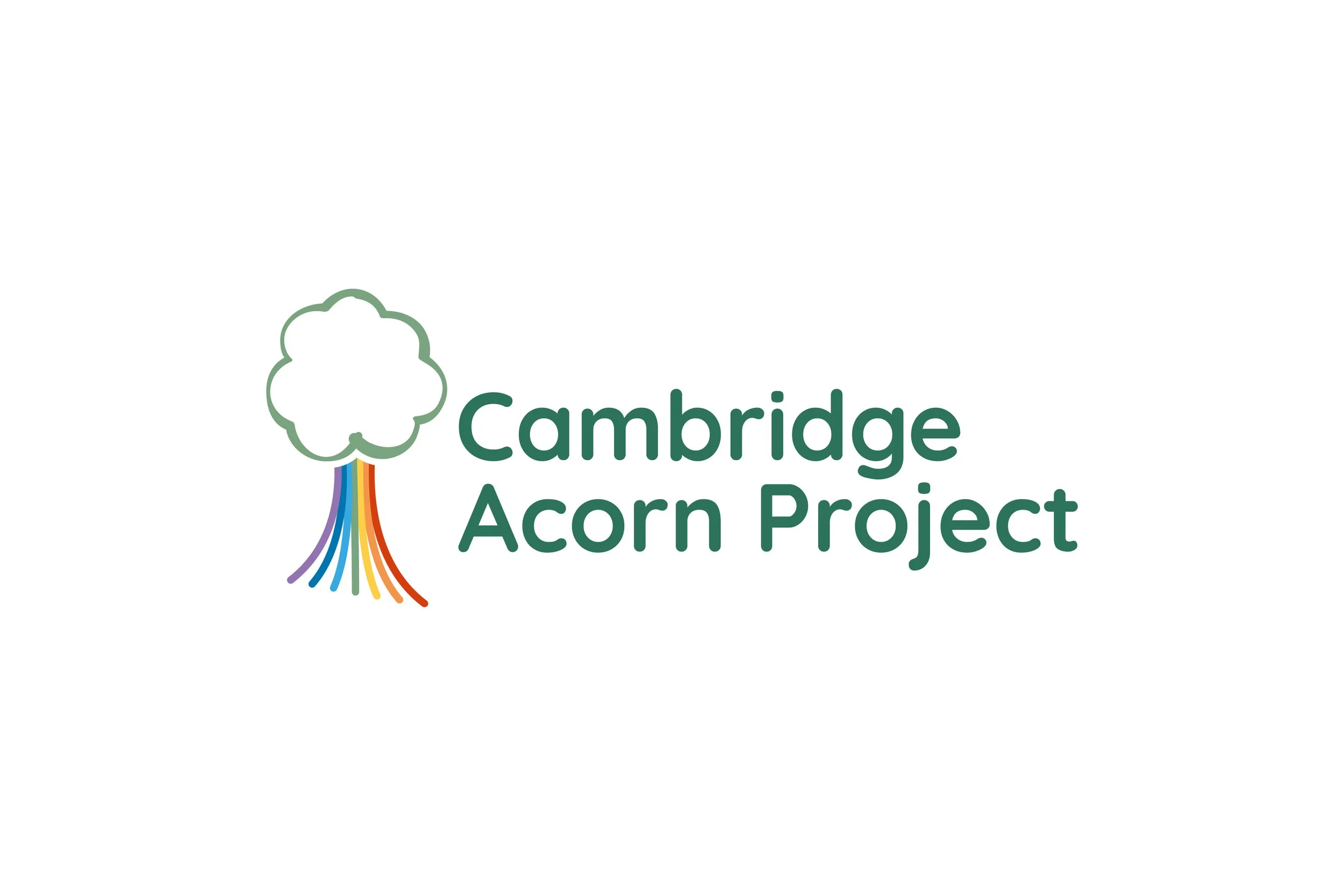
Just Digital initially concepted a range of ideas and worked with stakeholders to refine the final logo. The result was a refreshed logo with a nod to their very first logo, with new brand font, bolder colour palette and refined tree icon.
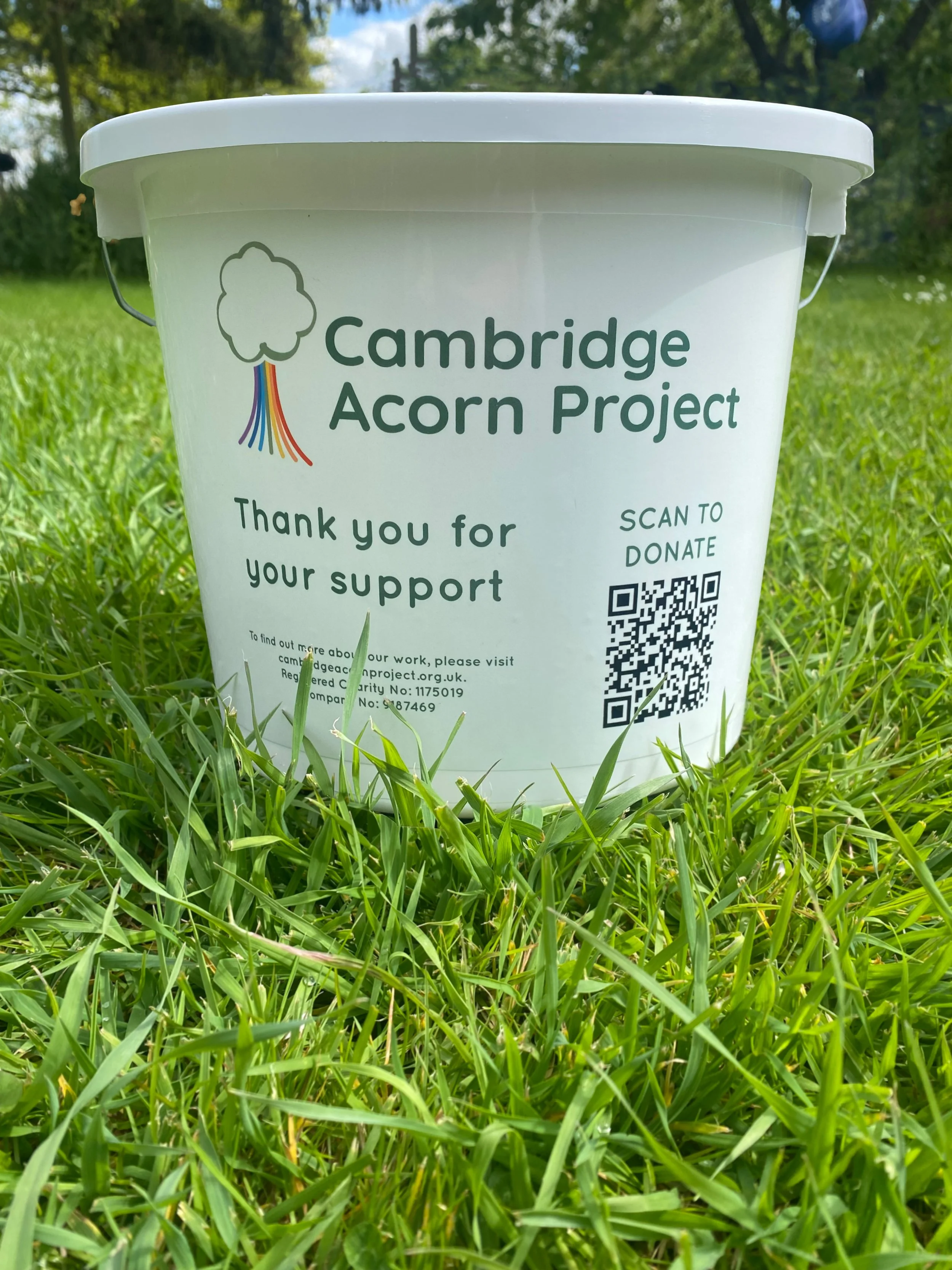
The tree now incorporates colourful tree roots, each colour representing one of the seven pathways that CAP tailor to support each family. The leaves of the tree have been simplified to an outline with an uneven line weight, as if hand drawn by a child. This shape has also become a graphic element used throughout the rest of the brand to enhance brand recognition.
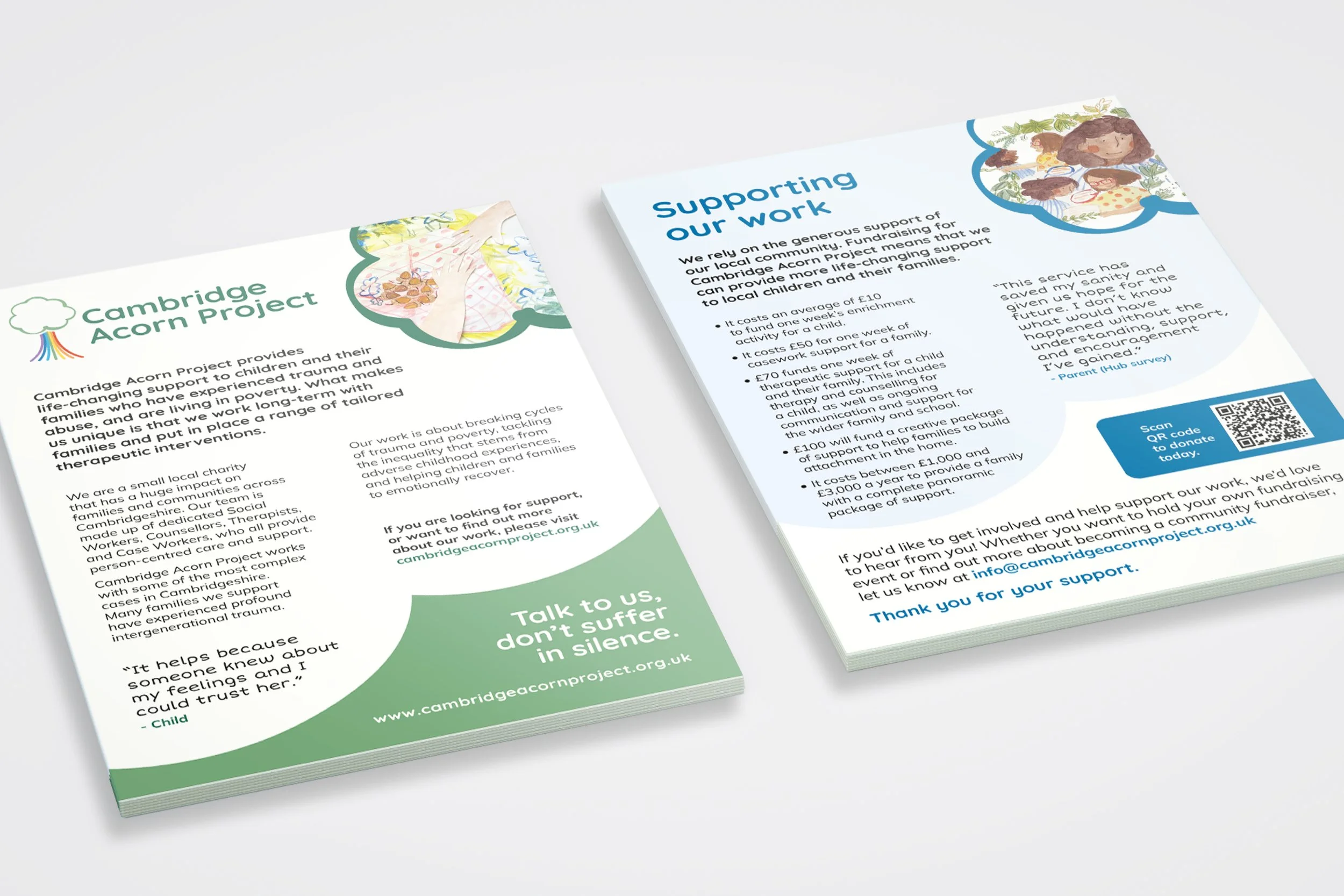
Following on from the logo refresh JD created full brand guidelines, covering fonts, colours, graphic elements, and marketing templates. We created easy-to-use guides that the charity and volunteers could use to self-serve, while retaining the brand to make the most of brand awareness across Cambridgeshire.
The overall styling conveys a friendly, approachable feel and reflects how the Cambridge Acorn Project has grown over the last 10 years.
Client Feedback
‘The rebranding work that Just Digital have done for Cambridge Acorn Project has been amazing. Our old logo was created when we first formed 10 years ago. Since then, we’ve grown and changed considerably, and our old logo was not working for us anymore. The old logo was unclear when small, and we had no clear guidelines or templates to ensure a consistent look and feel.
Through our partnership with Just Digital, we now have a new brand identity. We have a new logo, new brand guidelines, and templates to help us easily create our own resources. Throughout the process, Just Digital listened to us and took time to understand our requirements.
The feedback we’ve received has been really positive, and we are already seeing the benefits from this work. We hope that by having a clearer and more consistent brand, awareness of our organisation will grow, which will help us to continue growing in the future.’


